Online design magazine Design Week has relaunched today after closing in January, with an updated visual identity informed by the Bauhaus.
Originally launched as a print publication by writer Jeremy Myerson in 1986 before going fully digital in 2011, UK-based Design Week announced its closure in December 2023.
The online publication was subsequently acquired by Liverpool-based web development company Interconnect in May, saving it from closure.
Today, Design Week has been relaunched by publisher David Coveney and designer Chris McInerney.
The publication has a new editorial team comprised of former It’s Nice That editor-in-chief Rob Alderson, who is Design Week’s new editor, and senior writer Clare Dowdy, who was previously part of the Design Week team and has written for titles including Wallpaper* and Monocle.

“I see us as raucous cheerleaders for design and designers,” said Alderson of Design Week’s current team.
“We want to celebrate the things – people, work, ideas – that make the industry great. And we’re determined to support those working to address its shortcomings,” he added.
According to Alderson, Design Week’s key future objectives are to cover more digital design, platform more design being created outside of London, and to maintain and expand the publication’s traditional business focus.
“The capital is a design powerhouse, home to one-third of our design businesses. But it follows that two-thirds of our design businesses are elsewhere, and we want to reflect that,” said Alderson.
“And it’s important not to treat the rest of the country as a homogenous whole – we want to delve into the particular scenes all around the UK and Ireland, from Brighton and Bradford to Dublin and Dundee,” he continued.
Alderson also emphasised Design Week’s community-led approach, pledging that the rebooted publication will strive to connect designers and investigate the “highs and lows” of running a design business.
“Of course at this stage, all these ideas are untested, shimmeringly perfect in their abstraction,” acknowledged Alderson. “Some of our instincts and plans will be right, some will be way off. Part of the fun will be learning which is which.”
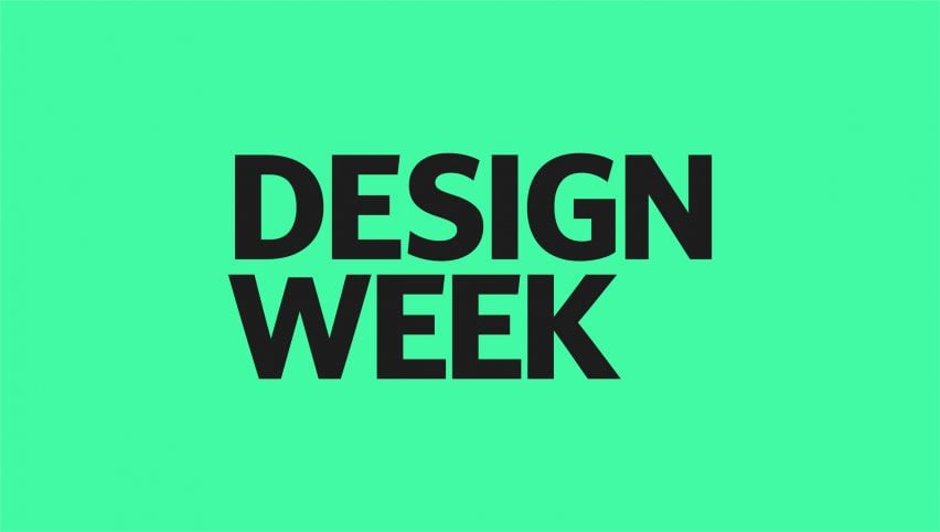
Coveney and McInerney collaborated to produce a fresh identity for the website, centred on a new logo in a humanist sans serif typeface that references the clean and functional shapes associated with the Bauhaus movement.
The capitalised logo is a departure from the publication’s previous branding, which featured the word “design” in lowercase with “week” written vertically in smaller lettering.

“I wanted to give each word equal prominence because Design Week is known by its full name, and to make it as loud and proud as possible,” explained McInerney.
“The most important thing was taking the DNA of the old branding, and accepting we’re in a new place,” he added. “We wanted a connection with the past, but to inject a bit of swagger, and be more confident.”
The imagery is courtesy of Design Week.

