We continue our series on mid-century modern design with a profile of Eero Saarinen, the Finnish-American architect and industrial designer whose creations were adopted as the optimistic symbols of a new post-war age.
“We have chairs with four legs, with three and even with two, but no one has made one with just one leg, so that’s what we’ll do,” Eero Saarinen told his friend, designer Florence Knoll, ahead of a new design project.
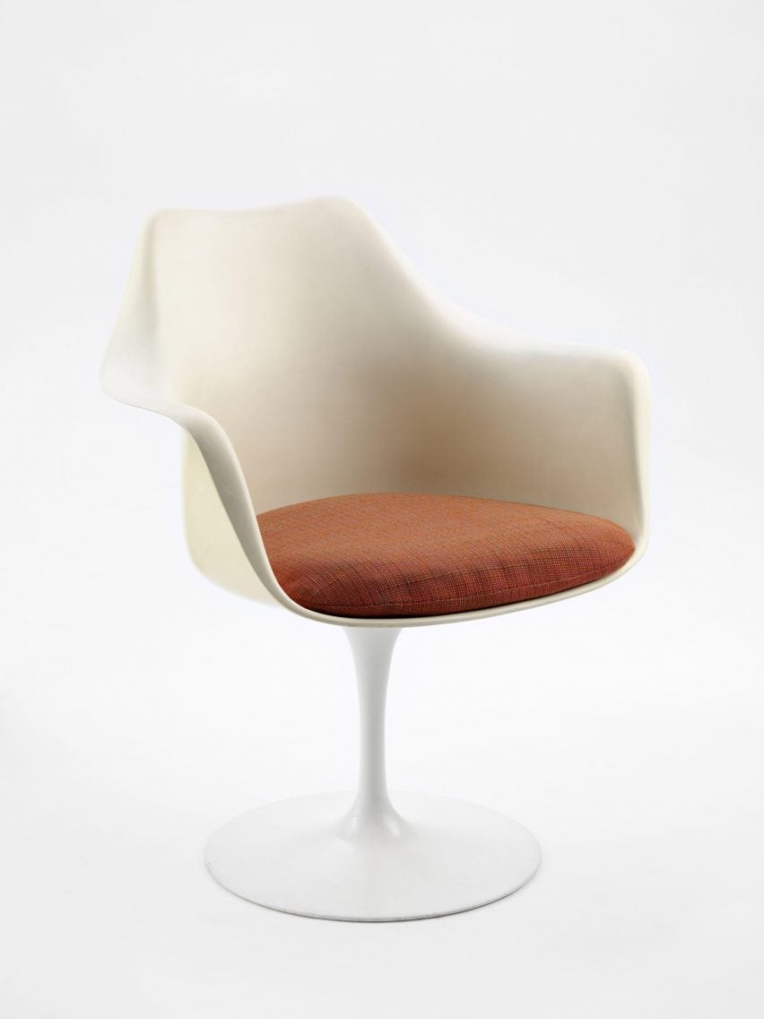
With that, the iconic, wine glass-like form of the Tulip Chair was born, a design that, along with the soaring concrete wings of the TWA Flight Center, would become synonymous with the design of the so-called “American century.”
Labelled everything from organic and space age to neo-futurist and proto-postmodernist, critics had a hard time assigning Eero Saarinen with a particular style, his work instead defined by its constant revision and experimentation.
Eero Saarinen wanted to break away from the rigorous rules of European modernism, which he termed “the measly ABC” according to curator and historian Donald Albrecht’s book about the designer, Shaping the Future.
He aimed to demonstrate that the well-worn mantra of “form follows function” didn’t mean just building orthogonal boxes – or four-legged chairs.
Eero Saarinen began creating at a young age
Born in 1910 in Kirkkonummi, Finland, to architect Eliel Saarinen and textile artist and sculptor Loja Gesellius, both Eero and his sister Pipsan grew up immersed in the professional world of their parents.
“By the time Eero was five, his talent for drawing had shown itself,” said a 1956 TIME Magazine article. “Sitting under his father’s drafting tables, he busily turned out his own versions of door details and houses.”

Eero Saarinen was 13 when the family emigrated to the USA. They settled in Bloomhill Fields, Michigan, where the publisher George Booth had invited Eliel Saarinen to design a new education, research, and public museum complex – the Cranbrook Educational Community.
True to form, Eliel Saarinen enlisted the rest of the family in this endeavour, with Pipsan contributing decorative details and Loja creating custom fabrics.
The young Eero Saarinen, who had begun studying what historian Tracy Campbell called his “first love” of sculpture at the Académie de la Grande Chaumière in Paris, was tasked with designing a range of furniture for the campus.
The designer followed in his father’s footsteps
His art deco pieces drew on traditional Scandinavian design, and Booth even agreed to allow Eero Saarinen to license them, effectively giving him his first industrial design contract when he was still only 19 years old.
This burgeoning career in furniture design was to be deferred, however, in favour of architecture, with Eero Saarinen later recounting how “it never occurred to me to do anything but follow in my father’s footsteps.”

In 1931, he headed to Yale to study architecture and was awarded a fellowship that enabled him to tour Europe and North Africa after his graduation in 1934.
After his travels, Eero Saarinen returned to Michigan, working alongside his father both at his architectural practice and at the Cranbrook Academy of Art.
Here, Eero Saarinen would meet designer Charles Eames, whom Eliel Saarinen had appointed head of the school’s industrial design department, and his early interest in furniture design would be given a new outlet.
Eames collaboration resulted in moulded-plywood chair
Eero Saarinen and Eames teamed up to submit an entry into the Organic Design in Home Furnishings competition at the Museum of Modern Art in New York.
While their winning design – a chair made of moulded plywood aptly named the Organic Chair – proved too difficult to manufacture at the time, it would act as a prototype for what would become a hugely recognisable element of both designers’ later works.
Not long after, in 1943, Florence Schust, a longtime close friend of the Saarinen family, would join the company of Hans G Knoll, with the two marrying three years later.
At Knoll Associates, Florence Knoll was instrumental in bringing the furniture designs of many architects into the mainstream.
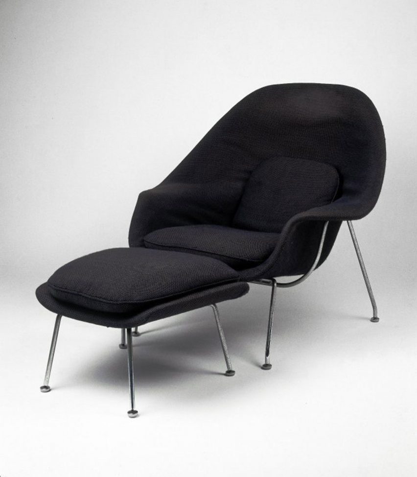
It was her brief to Eero Saarinen to create a chair “like a great big basket of pillows I can curl up in,” that led to the Womb Chair in 1948, a lounge chair that embraces the sitter with a deep, moulded fibreglass shell covered in padding.
Eero Saarinen wanted to clear up “slum of legs”
Experimentation with these materials and forms continued, and Eero Saarinen was known to work through hundreds of models and prototypes to find the perfect curves and proportions.
This culminated in 1958 when he debuted the one-legged Pedestal series, including what would later be known as the Tulip Chair and Tulip Table.
“I want to clear up the slum of legs,” he said of their streamlined design, “I wanted to make the chair all one thing again.”
While Eero Saarinen’s early work in architecture was often guided by his father’s more traditionally modernist approach, he soon began to bring the level of experimentation found in his furniture designs into an entirely new scale.

His breakthrough as an architect in his own right came in 1948, when he bested both his father and the Eames Office to win first place in the Jefferson National Expansion Memorial Competition in St Louis, Missouri, proposing the now iconic Gateway Arch.
Described by the architecture critic David Dillon as a symbol of “boundless American optimism”, this 192-metre-tall stainless steel arch would become the tallest in the world when it opened in 1964.
When Eliel Saarinen died in 1950, Eero Saarinen took over the firm, and over the subsequent decade, he quickly became the go-to architect for corporate clients.
The first high-profile client was General Motors, for which Eero Saarinen would design the Technical Center campus, including a domed showroom and open-plan offices illuminated by gridded luminous ceilings.
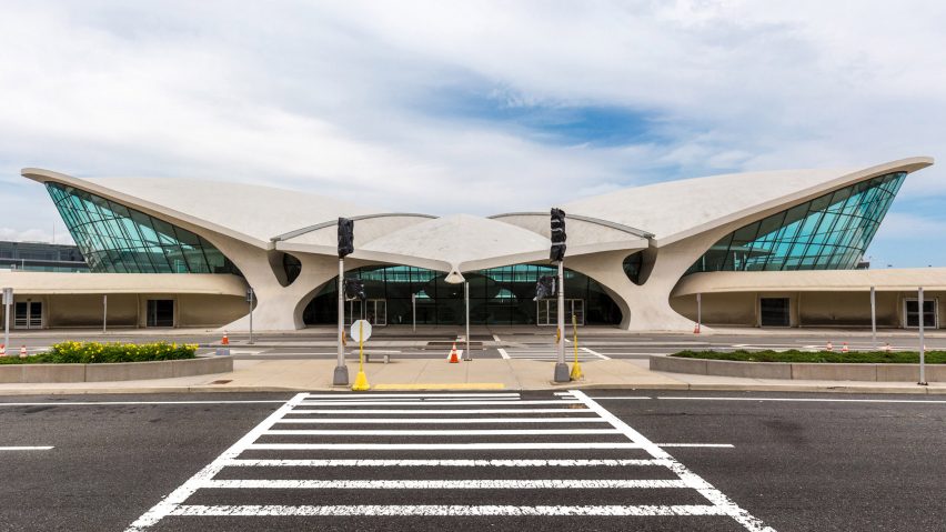
The same year, he was also appointed to design the TWA Flight Centre at JFK Airport in New York, which was intended to capture what he described as the “sensation of flying” in its swooping concrete roof structure and streamlined, fluid interiors.
For IBM Computers, the firm made a lightweight orthogonal structure clad in vibrant blue glass – the world’s thinnest exterior wall at the time – and for the CBS broadcasting network, the firm would design its only skyscraper in Manhattan.
Eero Saarinen’s projects incorporated interiors and furniture
Echoing the “total design” approach that echoed his father’s earlier work at Cranbrook, Eero Saarinen would frequently lavish attention on interiors, introducing dramatic staircase lobbies as well as furniture by himself and his peers that challenged typical modernist office design.
The Model 71 and Model 72 or “Executive Chair” series, for example – a toned-down version of his more dynamic plastic designs – were designed to look just as at home in the conference room of a corporate office as they were in a modern living room.
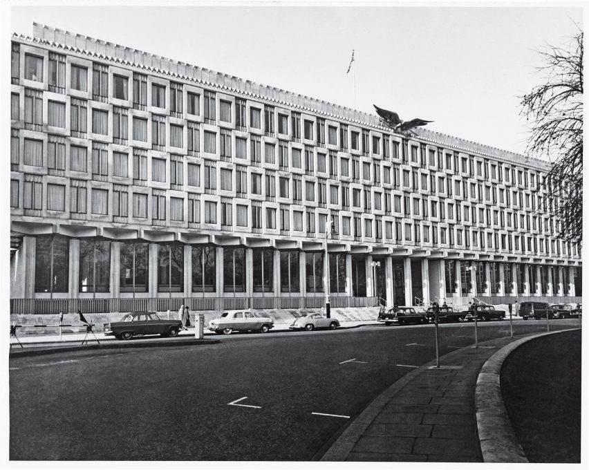
Eero Saarinen’s lack of a signature style and constant experimentation likely played a part in making him so attractive to commercial clients keen to create an impression, but it led to a mixed critical reception from architectural circles.
“The critique was over the variety in his work, each client getting a different form, or, technology, or material,” historian Albrecht told Dezeen.
“In the era of Mies, this meant Saarinen was pandering to each client and didn’t have a signature style,” he added.
Despite his firm’s rapid accumulation of work, some of Eero Saarinen’s most famous designs – including the Gateway Arch and TWA Flight Centre – were ones that he would never live to see complete.
In 1961, he died at the age of 51, while undergoing an operation for a brain tumour in Ann Arbor, Michigan.
Eero Saarinen would be posthumously awarded the AIA Gold Medal a year after his death in 1962, but even long after his death, his work would continue to be overlooked by critics.
It was only in the 1990s, when a new age of iconic form-making and renewed interest in technology began, that many would reassess just how prescient Eero Saarinen had been three decades before.
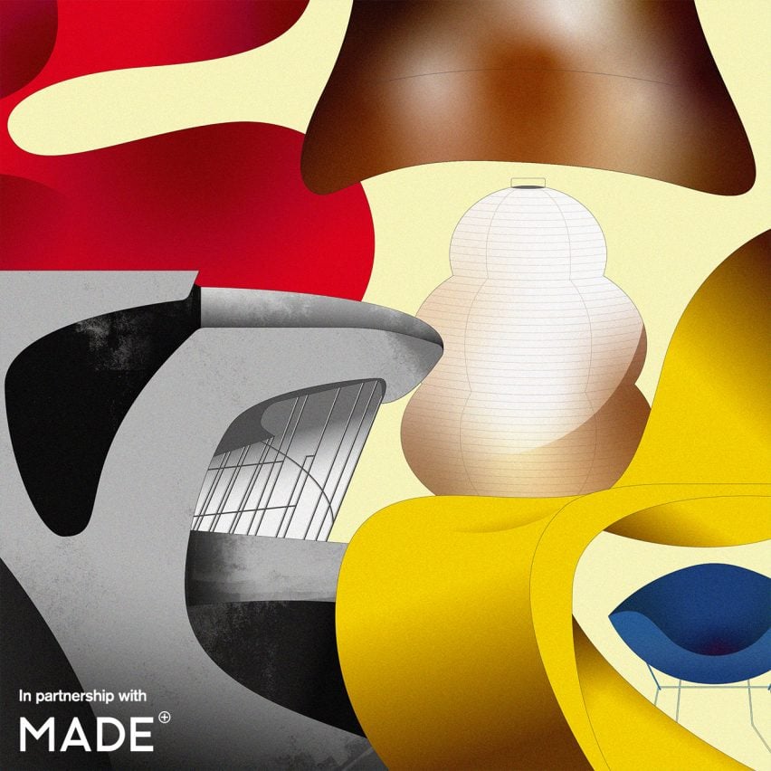
The main illustration is by Vesa S.
Mid-century modern
This article is part of Dezeen’s mid-century modern design series, which looks at the enduring presence of mid-century modern design, profiles its most iconic architects and designers, and explores how the style is developing in the 21st century.
This series was created in partnership with Made – a UK furniture retailer that aims to bring aspirational design at affordable prices, with a goal to make every home as original as the people inside it. Elevate the everyday with collections that are made to last, available to shop now at made.com.

