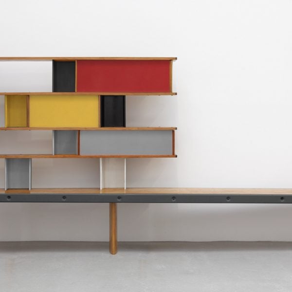
The latest story in our mid-century modern series explores how designer Charlotte Perriand stepped out of the shadow of her mentor Le Corbusier in the 1950s and created a pioneering modular storage system.
Originally developed on a small budget for even smaller rooms in two new student halls at the Cité Internationale Universitaire de Paris, the storage system featured a flat-pack wooden frame with modular compartments made of folded aluminium.
The standardised, industrially produced metal components could be lacquered in different colours and assembled in different configurations, creating storage with unprecedented adaptability.
At Steph Simon Gallery in Paris, where the public could purchase the bookcases or Bibliothèques from 1956, Perriand even sold these compartments individually, alongside other modular “hardware” like shelves, trays and sliding panels.

These could be used to customise the shelving system – and other furniture like desks and wardrobes – to the needs of the owner.
“Although revolutionary, this concept of kit furniture adaptable by the customer did not achieve the expected success,” explained the catalogue of a 2005 exhibition on the designer’s work at the Centre Pompidou.
“Undoubtedly too far ahead of her time, Charlotte Perriand did not realize that the public was not yet ready for so much freedom.”
It wasn’t until the 1990s, when they started showing up on auction blocks in Paris and New York, that the Bibliothèques would become a “cult piece of design furniture”, according to Jacques Barsac, who oversees the Archives Charlotte Perriand alongside the designer’s daughter.
Today, the original shelving units sell for upwards of €100,000 at auction houses like Christie’s and Sotheby’s, with some fetching over €500,000.
But when Perriand originally created the shelving in 1952 for the new Jean Sebag-designed Maison de la Tunisie student halls in Paris, the budget covering all the furniture for the rooms including a bed, desk, chair and wardrobe was a mere 150,000 francs.
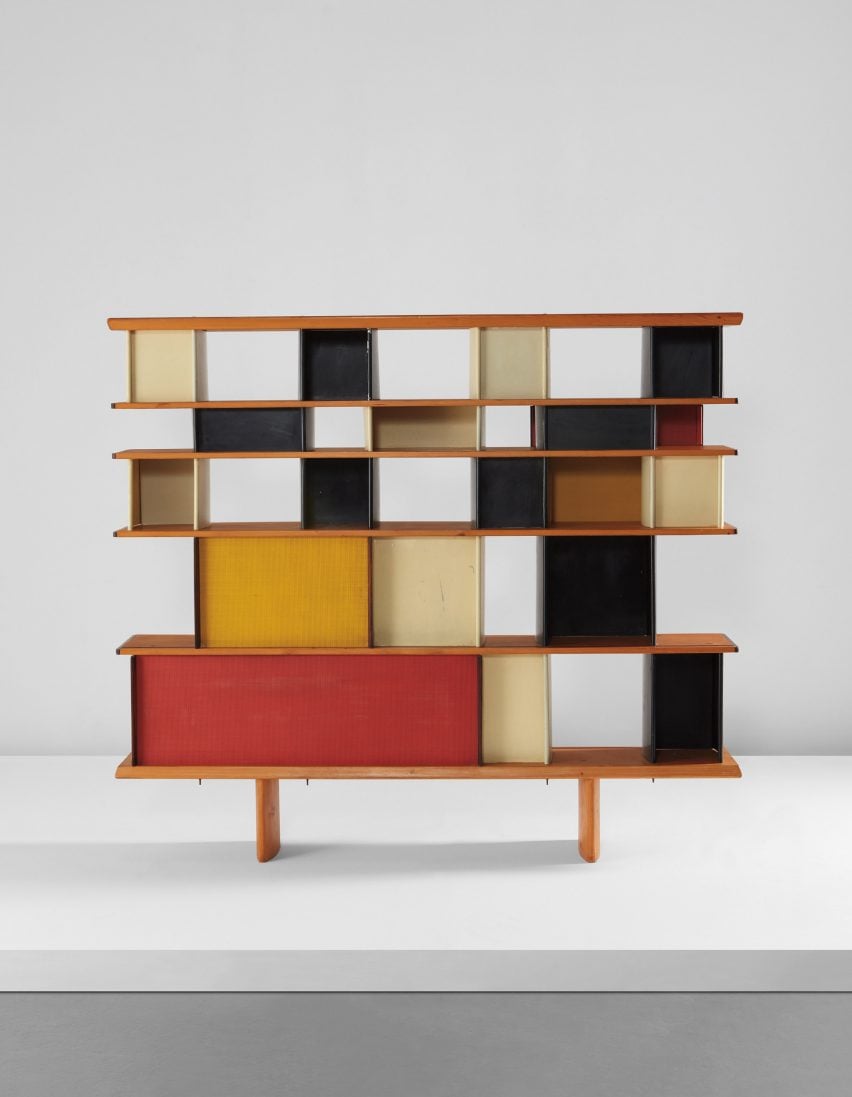
Crucial to the relative affordability of her storage units were their prefabricated aluminium modules, mass-produced in the metal workshop of architect Jean Prouvé in Nancy.
These metal compartments weren’t just decorative but actually supported the shelves and braced the whole furniture piece, reducing the need for more expensive, hand-crafted wooden components.
The Bibliothèques were a marked departure from the tubular steel seating Perriand had created for architect Le Corbusier’s studio in the 1920s. These include the iconic 4 chaise longue, previously known as the LC4 Chaise Longue, which proved too expensive to produce in large numbers.
“It was quite elitist because only a very small volume of pieces could be made,” said Dominic Lutyens, author of Design Monograph: Perriand. “They were very expensive and so had a very limited audience.”
“But there was a point at which Perriand felt that design should be a lot more democratic,” he told Dezeen. “And one way in which that could happen for her was through the use of prefabrication.”
In light of the post-war housing crisis, space-saving shelving became a primary concern for many mid-century designers. And Perriand was among the most prolific, leading French newspaper Le Monde to dub her the “high priestess of storage”.
“Storage is a priority,” Perriand said at the time. “It must be resolutely industrialised.”
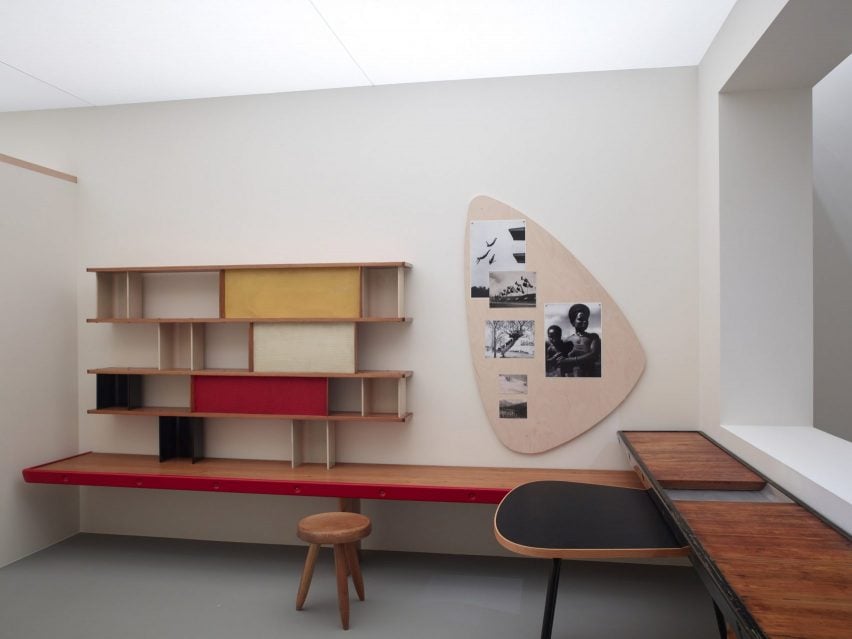
Perriand designed her Bibliothèques to make the most of the compact bedrooms in the Cité Internationale Universitaire de Paris student halls, measuring only 15 square metres.
“She enumerated what was necessary for a student’s daily life: shoes, clothing, bed covers, files, books, et cetera, whose dimensions she took down so as to be as exact as possible in the storage volumes,” Barsac wrote in Charlotte Perriand: Complete Works.
Like many of her pieces, the Bibliothèque Maison de la Tunisie was designed to fulfil multiple functions at the same time, with one of its shelves extending to form a bench seat.
Similarly, the adapted storage unit that Perriand created for Jorge Medellin’s Maison du Mexique, which followed a few months later, functioned as a freestanding partition between the bedroom and bathroom.
Accessible from both directions, it provided storage for toiletries on one side and books on the other, either proudly displayed or hidden away behind sliding doors.
“She really pioneered open-plan spaces,” Lutyens said. “One of Perriand’s room sets for fairs in the 1920s used storage cabinets as room dividers so conceptually, she was quite ahead of her time in this respect.”
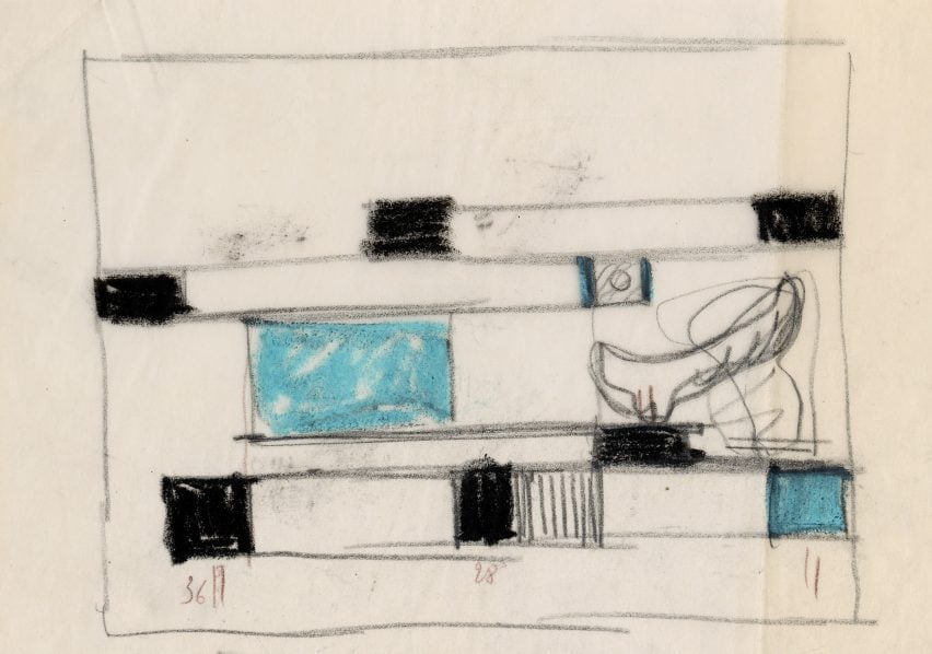
The individual components for the shelving were flat-packed and ultimately assembled on-site by cabinetmaker Jean Chetaillecuts, who also created their wooden structure.
Perriand went on to create myriad variations of the design under the title Nuage, meaning cloud in French, produced and sold by Galerie Steph Simon until 1970.
The name is a nod to the original inspiration behind the design, which she found in the Sukiya-style cabinets of Kyoto’s 17th-century imperial villas.
“I noticed some shelves arranged on the walls in the form of a cloud,” said the designer, who went to Tokyo in 1940 as war was breaking out in Europe to consult on a Ministry for Commerce programme focused on modernising Japanese crafts for export.
“This is where my cloud-shaped bookshelves came from with aluminium connecting elements, a free form that gives rhythm to space and enhances the objects it supports,” she wrote in her autobiography. “Starting from these elements, I could freely create entire walls or reduced combinations, or even furniture.”
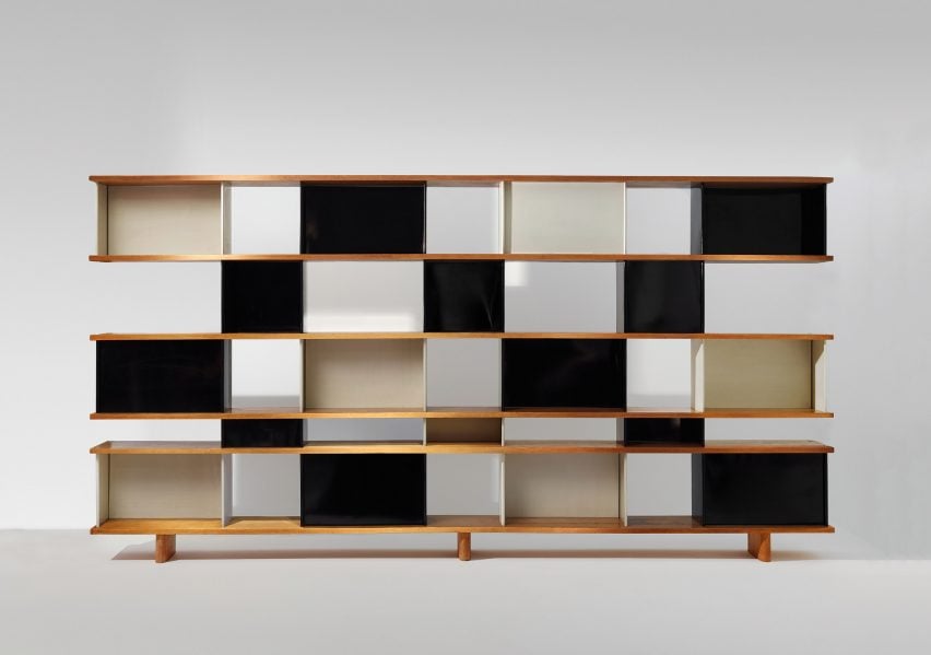
Like so many works by women in the European modern movement – including Perriand’s designs for Le Corbusier – her family says Nuage was later falsely credited in part to Jean Prouvé and was embroiled in a lengthy legal dispute before being reissued by Italian furniture brand Cassina in 2012.
“Charlotte gave her whole life for her copyright to be recognized,” her daughter Pernette Perriand told Domus at the time of the launch.
“The money from the Cassina reissues allowed Charlotte to live and write books, to organize exhibits and keep the memory of her work alive, maintaining the archives.”
Today, Perriand is considered one of the most influential designers of the 20th century, with several high-profile exhibitions at London’s Design Museum and the Fondation Louis Vuitton reappraising her work in recent years.
The show in Paris featured a full-scale recreation of a Maison de la Tunisie bedroom and marked the first time the whole Frank Gehry-designed gallery was given over to the work of a single artist.
Unless otherwise stated, all imagery is from volumes two and three of Charlotte Perriand: Complete Works by Jacques Barsac, courtesy of Scheidegger & Spiess.
Mid-century modern
This article is part of Dezeen’s mid-century modern design series, which looks at the enduring presence of mid-century modern design, profiles its most iconic architects and designers, and explores how the style is developing in the 21st century.
This series was created in partnership with Made – a UK furniture retailer that aims to bring aspirational design at affordable prices, with a goal to make every home as original as the people inside it. Elevate the everyday with collections that are made to last, available to shop now at made.com.

