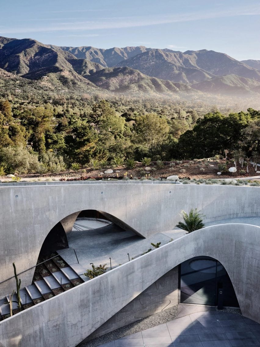
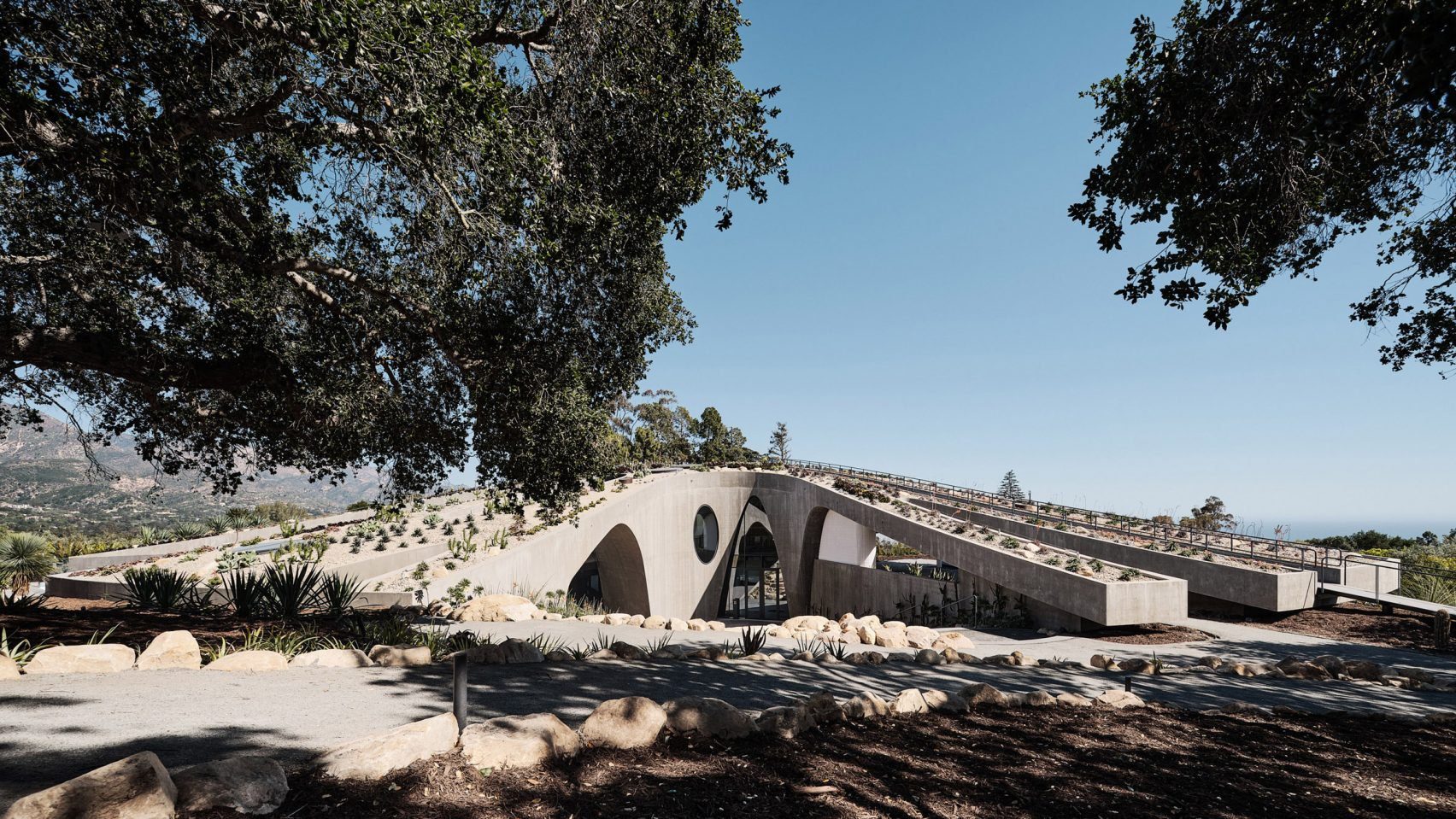
In this week’s comments update, readers are discussing a submerged concrete and glass house in California, designed by local studio Donaldson + Partners.
Seven years in the making, the circular structure features large concrete parabolic arches and was envisioned as a “house for the twenty-first century”.

“Those views, yet the house is so introverted”
Commenters were split. “The architecture itself is very compelling – good spatial sequence, interesting vistas and integration of landscaping,” wrote Franky four fingers. “It gives off a cool Bond villain vibe,” they added.
Other commenters weren’t so keen. “Seven years in the making, 14,000 square foot, several million in cost, yet it has the feel and look of a parking lot on acid on the outside and an abandoned 70s art gallery on the inside,” ridiculed Souji.
BBOB was in the same boat. “That much money and time spent and you didn’t get a single comfortable space or beautiful piece of architecture to admire,” they observed.
Chris D was similarly incensed, arguing “this is awful”. “Those views, yet the house is so introverted,” they added. “Those warm landscape colours, yet the house is so cold and dreary.”
Meanwhile, Kemarino put forward “I don’t much like it as a home, but it’s a near-perfect party venue”.
Compelling or dreary? Join the discussion ›

“Affordable housing is an oxymoron”
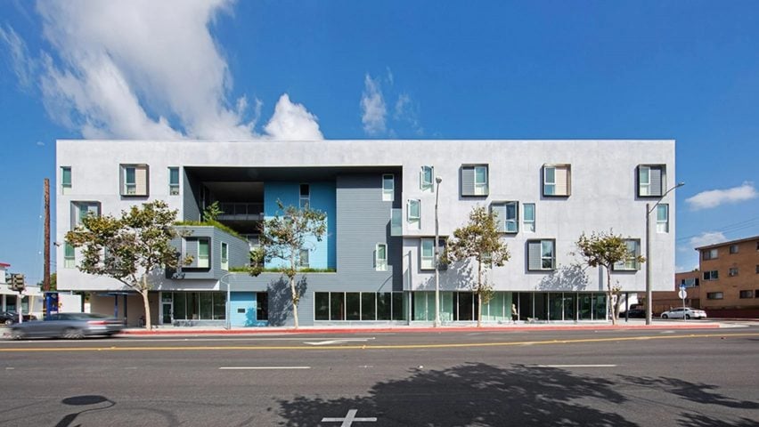
Readers also struggled to reach a consensus on an all-electric, affordable housing complex in Santa Monica, completed by architecture studio Brooks + Scarpa.
Commenter Jb took a blunt view, writing “cold-hearted functionalists should be precluded from involvement in affordable housing”.
“Question…why does ‘affordable housing’ always look like affordable housing?” asked Scot M.
“This is just rather humdrum – affordable housing always seems to have the aesthetics of cheap building blocks,” reflected Jason Long. However, they acknowledged “but a plus point is the power supply being all-electric, and the building has good energy credentials”.
Rob Rohena also recognised the strengths of the project, writing “the fact that they were able to make something that doesn’t look like a Costco big box store is commendable”.
They added that “affordable housing is an oxymoron, the problem isn’t an architectural one, it’s a socio-economic one”.
Have you had your say? Join the discussion ›

“Interesting and different while being of a modest and liveable scale”
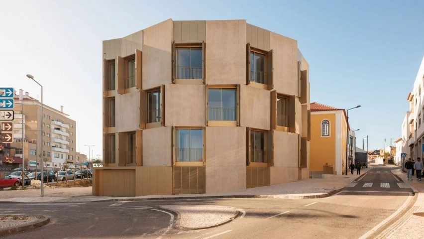
Another housing project that got readers talking this week was an apartment block wrapped in concrete and gold aluminium shutters, completed by architecture studio Bureau des Mésarchitecture on a corner site in Leiria, Portugal.
“My first reaction is that the floor plans are very elegant as a geometric exercise,” expressed Braves.
For Jack Woodburn, it was “interesting and different while being of a modest and liveable scale”.
On the other side of the argument, Souji wrote “not only is it tacky by trying to seem sleek, it also has an awful layout”.
“The way this building meets the street cobblestone walkway is haphazard, probably not considered – pity,” lamented Marius.
“This project would have benefitted from fewer architectural ‘moves’ and/or a slightly bigger site,” suggested MKE Tom. “The detailing on the other hand is quite nice,” they allowed.
Elegant or tacky? Join the discussion ›
Comments Update
Dezeen is the world’s most commented architecture and design magazine, receiving thousands of comments each month from readers. Keep up to date on the latest discussions on our comments page and subscribe to our weekly Debate newsletter, where we feature the best reader comments from stories in the last seven days.

