The new 5 was their answer — and as van den Acker explains — de Meo seized it as the emblem for his now-famous Renaulution plan.
Van den Acker believes Renault will reap big benefits from using an emotional, retro-modern design, but he acknowledges there could be problems at replacement time for companies who have such designs — and nothing else. Renault isn’t in that position, he says. “We have other B-segment models,” he explains. “Led by Luca, we believe the 5 could go 20 years. But the Clio will change with the times.”
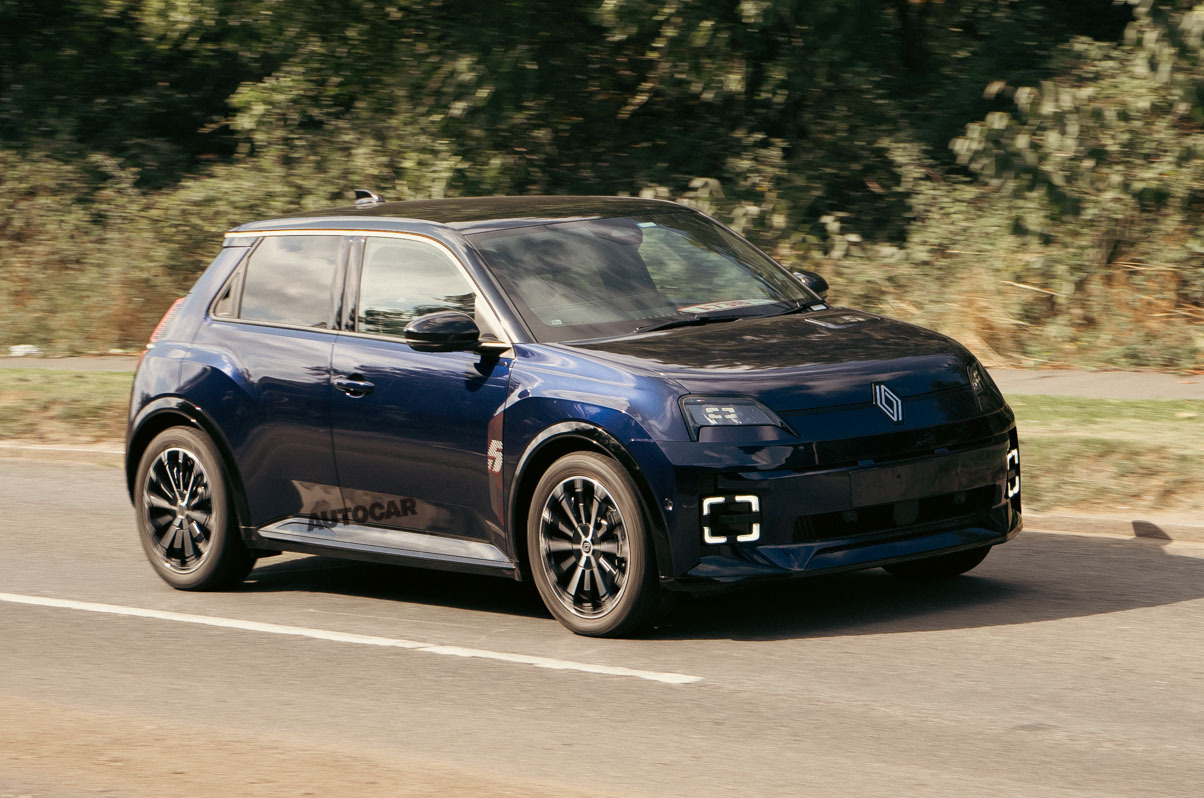
The exterior blends retro and modern cues, based largely on the concept but adopting a few subtle modifications for production: the front lighting signatures have been reworked, for example, so the headlight projectors now use more conventional blocks of LEDs, rather than the diffuse units on the concept.
These display a small square when the main beam isn’t in use, said to be inspired by the human pupil, and ‘wink’ as you approach the car with the key fob.
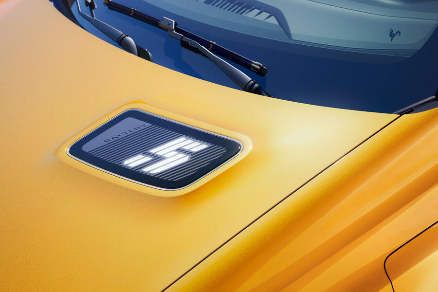
A charging indicator has been integrated into the offset hump on the bonnet, which references the asymmetrical cooling vent on the original 5.

This indicator fills a ‘5’ logo with light to represent the level of charge left in the batteries, allowing drivers to quickly gauge range without having to get in the car or check the app. Otherwise, the front end retains its blend of hard edges and swooping curves, mimicking the original 5.

