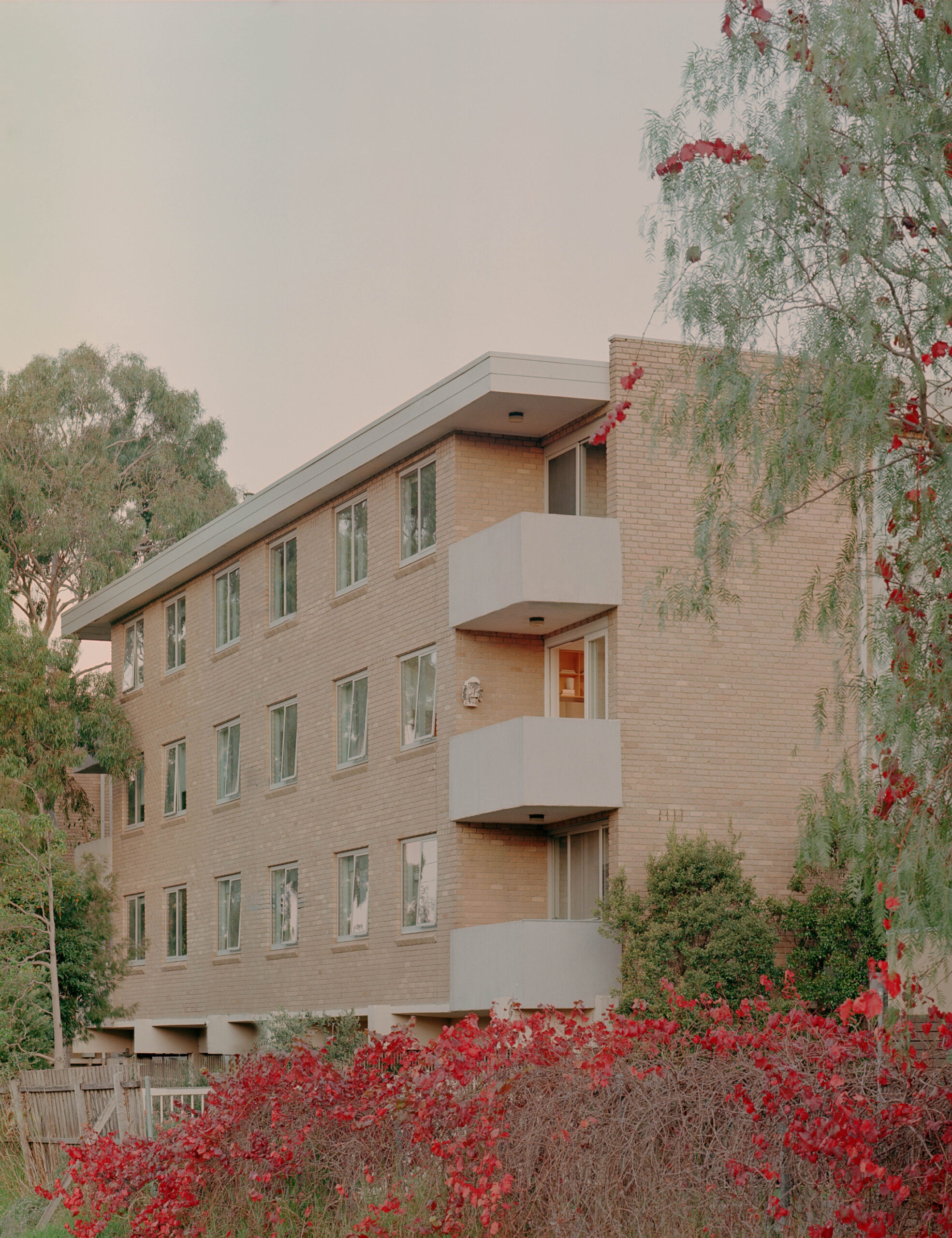
When Healy Ryan Architects were brought on to renovate this 1960s Melbourne apartment, its original appliances, popcorn ceilings, exposed brick walls, and tiles were all intact.
The owners were happy to see some of these features go, but not the perfectly preserved orange kitchen tiles.
‘Orange is so characteristic of ‘60s design and we felt repurposing these could be an interesting way to connect the original with the new,’ says Tom Healy, director of Healy Ryan Architects.
The tiles were lovingly removed, cleaned, and relaid to connect the original apartment with its new beginning, as a more open and bright home.
How the remainder of the apartment interiors would inform a modern design intervention was not immediately obvious to Healy Ryan Architects.
‘We wanted to engage with the history of the building, but did not want our addition to be faux period or overly nostalgic,’ explains Tom.
The architects decided to focus on the kitchen, introducing practical interventions to this central room, which previously lacked bench space and connections to the living area.
‘This last point was not a major issue for our clients, who were not keen on open-plan living, but we did feel that creating some openings would bring some notable improvements both to the functioning and feel of the apartment,’ says Tom.
Structural works saw the removal of one wall separating the kitchen from the living area, bringing new light and parkland views into the kitchen.
This new opening is now filled with a long benchtop, creating both a generous food preparation area, and a two-sided informal dining area.
Open and closed shelving provides a place for the client’s extensive collection of objects and books, while balancing their desire for both openness and separation.
Healy Ryan Architects considered multiple colours for the kitchen joinery before arriving at Dulux Trinket Gold, which again leans into the apartment’s original features.
‘In the end, we felt that bright orange cabinetry paired with the orange tiles was a bold and striking gesture and the right way to go,’ says Tom.
‘We saw our orange joinery, red cabinet handles, hardwood flooring and grey-brown stone as a harmonious addition to an existing melting pot of colours and textures.’
Without actually adding to the already generous apartment’s floor plan, Healy Ryan Architects have managed to maximise this space, and make the kitchen the social hub of the home.
‘Cooking, drinking and chatting can happen simultaneously and with ease,’ says Tom.
‘I also love the orange joinery and am happy (and relieved) that it worked!’

