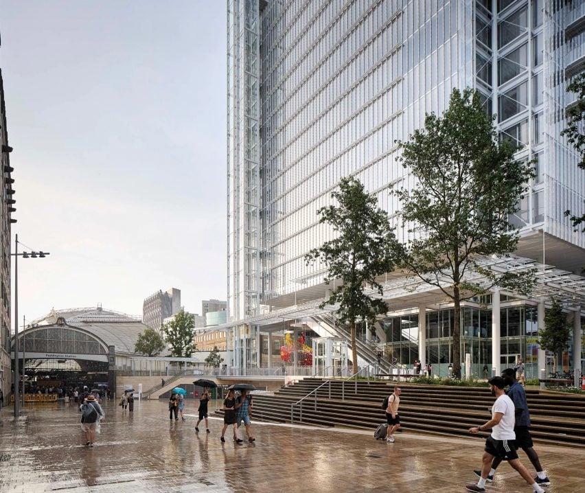
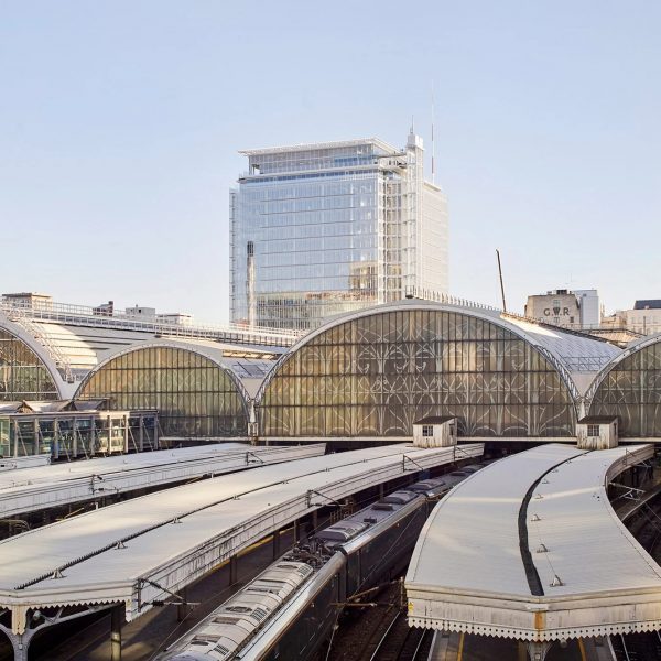
In this week’s comments update, readers are discussing Paddington Square, a contentious mixed-use building in London with curtain walls and an exposed steel structure completed by architecture studio Renzo Piano Building Workshop.
The 55-by-55-metre cube contains private offices, which make up the bulk of the building, while its base incorporates public amenities and a plaza connecting the building to the London Underground.

“What is wrong with the English?”
Commenters were divided. “This was very skillfully done, and I think this building will be greatly appreciated over the years” commended Burrlamb.
“Simple, elegant and taut in form and detail – expect nothing less out of this guy!” agreed MKE Tom.
But not all readers were quite so smitten.
“It’s just another nondescript glass box,” wrote a dismissive Alfred Hitchcock. “Piano didn’t even have to get out of bed to design this,” they quipped.
Other commenters drew parallels between the design of Paddington Square and The Shard. “Didn’t Renzo Piano Building Workshop design The Shard as well?” asked Z-dog, before adding “if it ain’t broke…”.
Meanwhile, Steve Matthews described it as “hideous”. The exasperated commenter asked “what is wrong with the English?” before suggesting that “they have wrecked every city with ugly, modernist, dystopian junk”.
Which side are you on? Join the discussion ›

“Lots of timber and subtlety”
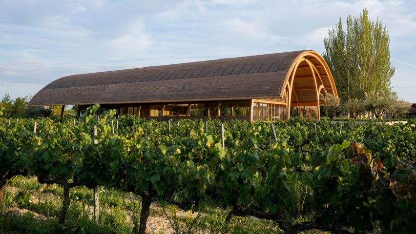
Another story that piqued commenters’ interest this week was a vaulted timber hall that Foster + Partners has added to Bodegas Faustino winery in Spain, characterised by an earthy material palette and overhanging roof. Readers were undecided.
“Love the Art Nouveau/Modernism feel”, applauded Souji.
However, MKE Tom struggled to make a decision, musing “I oculate between ‘damn that’s a nicely detailed building’ and ‘those triple arches are childish'”.
Man Like D was in the same boat. “Really liking Foster’s work of late – lots of timber and subtlety,” they wrote, but agreed that they were “not sure about the triple arch”.
Meanwhile, Colin MacGillivray thought “the building says railway station, not winery”.
What do you reckon? Join the discussion ›

“Very cold and unwelcoming”
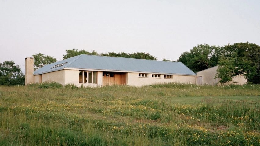
Readers were unconvinced about a house in Cornwall informed by the traditional farmsteads of England’s West Country, completed by Hugh Strange Architects with a rough render exterior and barn-like timber ceilings.
“Scale and proportions – that’s the key to ‘good’ architecture,” put forward Apsco Radiales. “While this house has some positive attributes, it could use some of those aspects – the roof is too low,” they said.
Souji thought it “feels claustrophobic and cold” and Whateverandeveramen concurred, calling it “very cold and unwelcoming”.
However, commenter Orangikaupapa went against the general consensus, declaring “I’ll stand alone”, before saying “I recognise the cues for this house and find the assimilation of place and idiom really lovely”.
Mark Zudini also had a positive take, writing “I enjoy the way this house exudes simplicity”.
Have you had your say? Join the discussion ›
Comments Update
Dezeen is the world’s most commented architecture and design magazine, receiving thousands of comments each month from readers. Keep up to date on the latest discussions on our comments page and subscribe to our weekly Debate newsletter, where we feature the best reader comments from stories in the last seven days.

