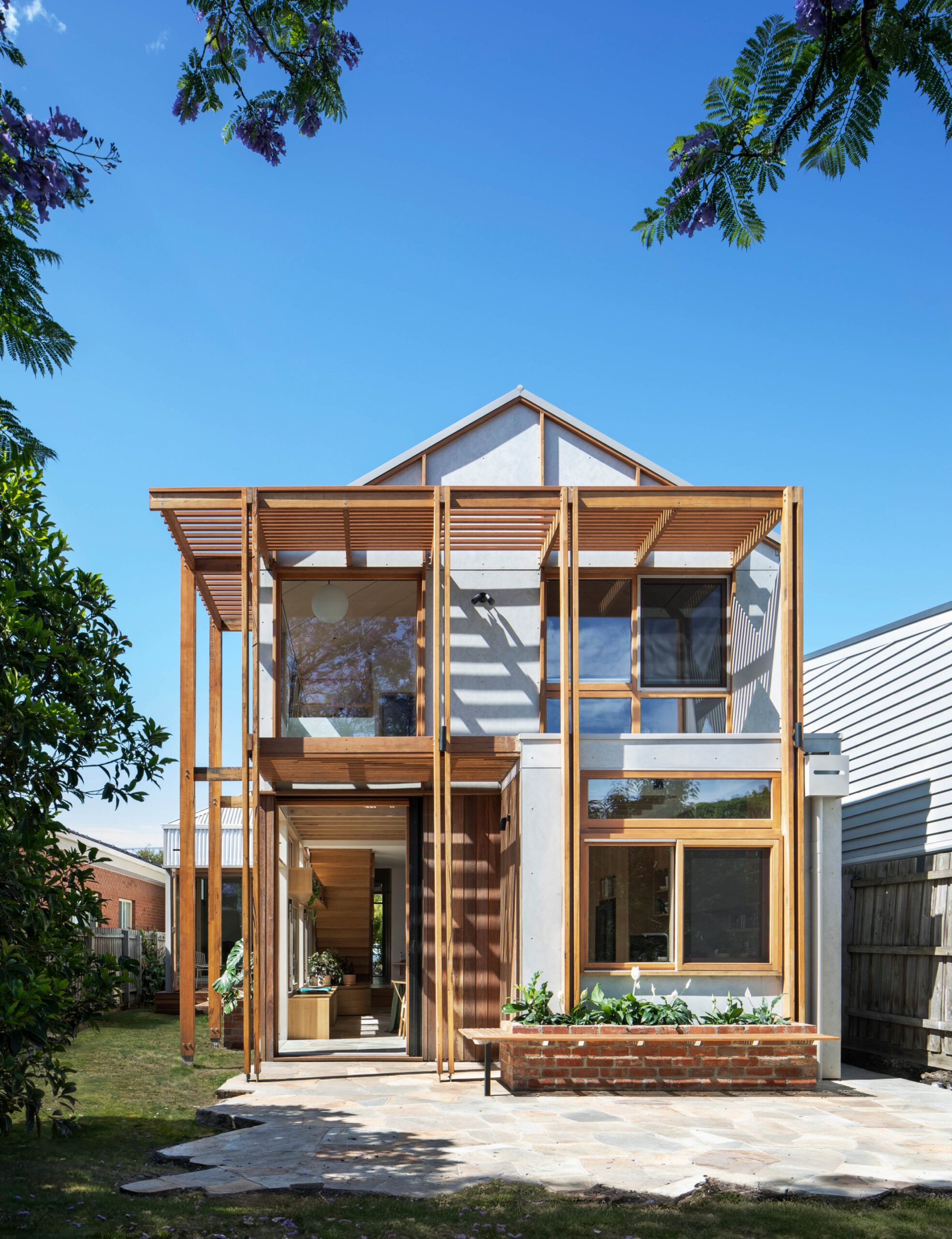
Life Cycle by Steffen Welsch Architects is a perfect example of the transformative power of ‘quiet architecture’.
‘Our ethos [is] inspired by Austrian architect Hermann Czech’s notion of buildings as background,’ director Steffan Welsch says. ‘A building is a background for your life, so while it can be beautiful, it needs to be functional first and comfortable as a stage for daily living.’
So, when owners of this Coburg weatherboard engaged the practice for a renovation that could bring ‘maximum flexibility’ to their family home, it was a priority that the addition made life feel ‘effortless’.
The existing property featured a large lean-to at the rear that dominated the backyard, while the floorplan itself needed reconfiguring to provide new spaces — including an office for running a consulting business from home, and room for accommodating family visits from overseas.
‘The lean-to required removal, providing us with the opportunity to move the new part of the house to the side boundary and increase the length of the backyard,’ Steffan adds.
In the new addition, they made space for new communal spaces, including a light-filled living, kitchen and dining room united by tactile crazy paving from RMS Traders for the flooring. Upstairs features a study for the family’s teenage children and bedrooms designed to capture views of the neighbouring trees and buildings.
Passive solar design was another key focus of the renovation, which carefully considered how the house could minimise energy consumption. For thermal comfort, insulation was added to the building fabric, and strategically placed doors and windows help to optimise natural light and air flow.
‘Our design foremost focuses on what you can’t see, requiring several small moves to provide an optimised and personalised environment,’ Steffan explains.
‘There are several interventions supporting our passive solar design. The pond, located southwest of the lounge, draws in cool air during summer. A netted void over the dining space is a thermal chimney — it pre-heats upstairs in winter and discharges hot air in summer. [And] an external timber frame emerging from the main building provides shading and filters light.’
The architects also reduced the overall embodied carbon of the home by using materials like recycled hardwood flooring, recycled timber battens, and GreenTag certified Laminex products. It culminates in a simple, pared-back interior palette, contrasting beautifully against the verdant greens of the Jo Henry-designed garden.
‘My favourite parts are always the things that you don’t see,’ Steffan says of the project. ‘The warmth and comfort, both visually and temperature wise; the balanced natural light; the little nooks and corners where one can retreat to; the internal vistas; and the inviting feel.’

