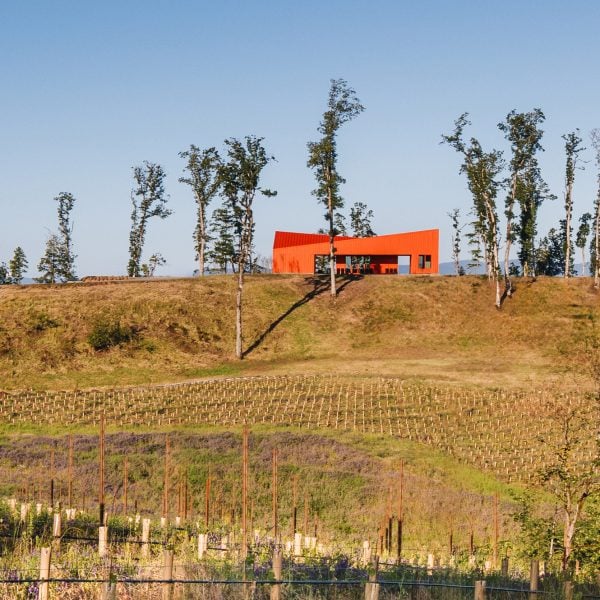
Portland-based Waechter Architecture used cladding with a red colour derived from a popular wine blend to create an angular winery on a site devasted by clear-cutting in Oregon.
Corollary Wines wanted to create a base of operations and space for entertaining on an abandoned site in Oregon’s Willamette Valley that had been cut clear of timber.
After an extensive reinvigoration of the permaculture on the site, Waechter Architecture was brought in to create an “economical” structure that would represent the company and create a scenic place to host tastings and business operations.
“The clients needed an attractive, all-in-one structure that could serve as an outpost for entertaining and a base of operations as their new estate vineyard takes root and matures,” Waechter Architecture founder Ben Waecther told Dezeen.
“We needed to be economical in scale and with materials while providing a space that sets the tone for future development and captures the individual, unconventional, and innovative spirit of Corollary.”
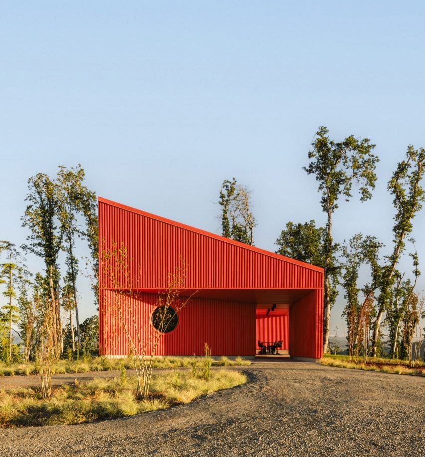
To fulfil these goals, the studio chose box-rib metal siding for the totality of the cladding due to its ease of maintenance and prevalence in local construction.
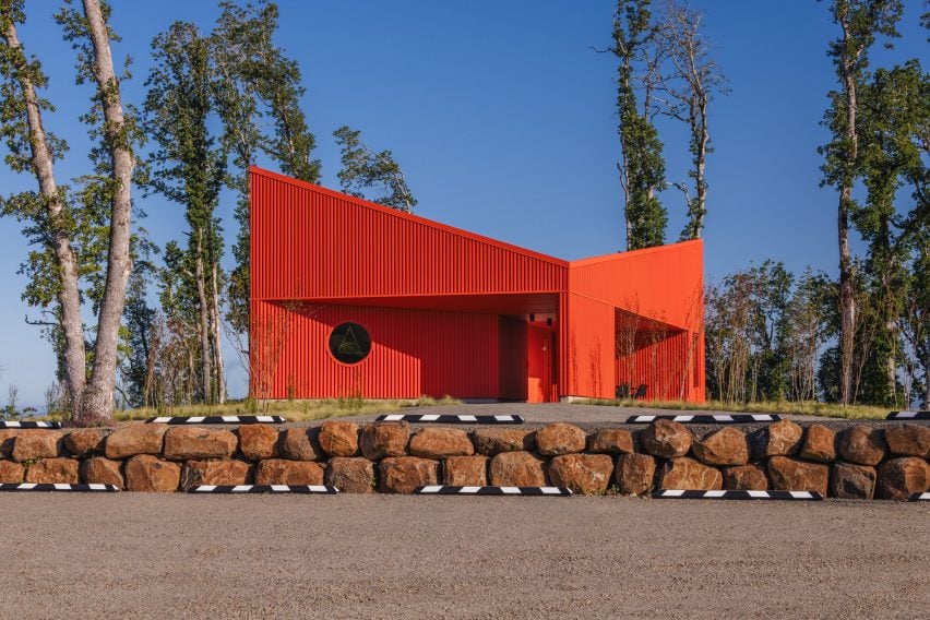
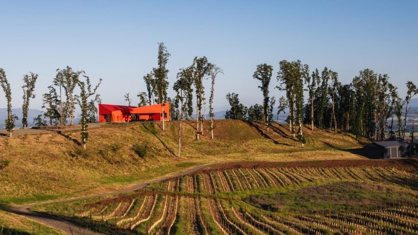
The siding was powder-coated in a red hue to reference one of Corollary Wines’ signature red wines, Cuvée One. According to the studio, this makes it stand out as an “outpost” as the area develops for wine production and distribution.
“It adds a pop of colour as a focal point for the verdant estate and echoes the red hue of humble agricultural buildings found throughout the region,” said Waechter.
Rectangular in form, the structure has a butterfly roof with each sloped aspect representing two parts of the plan, one semi-enclosed and three others that are completely enclosed.
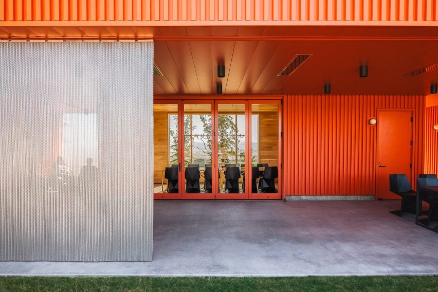
The entry program features a small porthole window and a recessed wall that leads towards a portal that leads to the semi-enclosed space. This area wraps around the enclosed space, sealed by French doors, where the primary tasting room is.
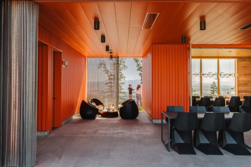
To protect the semi-enclosed spaces from the elements, the Waechter Architecture team installed operable chain curtains that also work to diffuse light.
The red panelling continued on the walls of the semi-enclosed place, while the interiors of the fully enclosed reception and tasting room were clad in white oak that the studio said was sustainably harvested by local, family-run company Zena Forest Products.
Oak has a special significance to the region and to the winery, which uses oak in the winemaking and storing process.
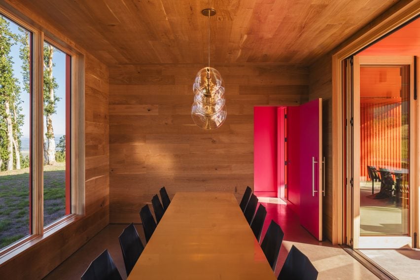
“Zena specializes in locally sourced and sustainably harvested timber, and has been managing their forests in Oregon’s Eola-Amity Hills for generations,” said Waechter.
“Aside from its value in winemaking, stands of white oak are found on Corollary’s estate, and are the last remnants of the forest ecosystem that was present prior to logging operations by the previous landowner in the 2010s.”
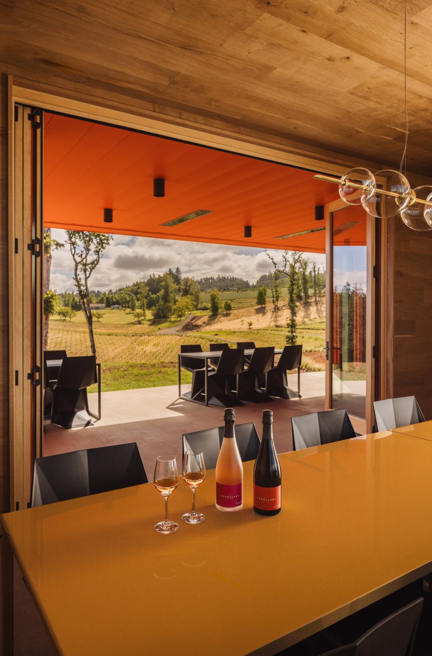
The interior decoration was carried out by one of the clients, Jeanne Feldkamp, who runs a studio called Heirloom Modern.
Black Vondom Voxel chairs are arranged around black tables in the outdoor space. The same chairs are arranged around wooden tables in the tasting room, with a simple blown glass chandelier running parallel above it.
A private residence and winemaking facilities are also planned for the site.
Waechter Architecture was established in 2008 and has completed other winery projects in the region, including an expansion for Furioso Vineyards – also in Oregon.
“Although they arrived at very different outcomes, there’s a simplicity and clarity of form and material that feels appropriate to each place and purpose, and is one of the defining characteristics of our work,” Waechter said of the two projects.
Other recent wine facilities include a barrel-vaulted winery in Spain designed by Foster + Partners.
The photography is by Pablo Enriquez.

